To produce a visual interpretation of a headline or news story from a newspaper of my choice.It could be political or humours, typographic or illustrative or all of the above.
design A1-A6
deadline 2nd November
I choose an interview on an old newspaper of Andy Warhol going onto MTV called '15 minutes'.
The World of Warhol TV
By BENJAMIN SECHER, The Daily Telegraph | September 29, 2008
the sun new york

I idea was to use the pink which was used a lot in his screen prints and posters.


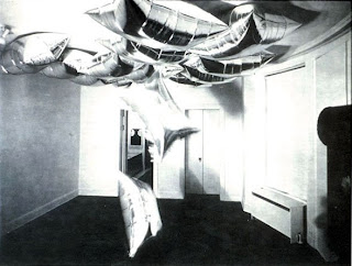
The silver was inspired by the factory as it was decreated in siver paint and foil.

These became the main ideas of what I wanted to produced,but like it be a more simpler.
I like the bricks as its about the factory.But not sure about the text weather to put it in or not.
The coloured stripes are the colours used as a TV screen I took this idea from one of Andy Warhol's photograph promoting his '15 minute' show.
The style I'm looking for was a Peter Saville very simple and Sharpe and clean look.


Need to think about competition:
I prefer it been a plain background but am playing where too put the typography and image.
This is my fav as the typography fits in the spaces simple and cleaver composition.


This is also one of my fav's being in the middle from the space but at the bottom. works well and is different.


the typography at the bottom does really work as well as the typography is as important as the image.


No comments:
Post a Comment